Pulse Chart
Overview:
The Pulse Chart in Busroot is part of the advanced analytics and reporting suite, allowing users to visualise real-time and historical variations in production and operational metrics. It is designed for production managers, engineers, and analysts seeking rapid, data-driven insights. Its core value is to clearly display periodic peaks, troughs, or cycles in process performance and identify opportunities or risks through instant visibility.
Use Cases:
- Process Engineer: Reviews cycle-by-cycle fluctuations to identify short interval losses and recommend quick corrective actions.
- Shift Supervisor: Monitors current vs. prior performance intervals to sustain momentum and respond to inefficiencies.
- Operational Leader: Analyses recurring spikes or drops to schedule interventions or confirm changes are yielding sustained improvements.
Functionality:
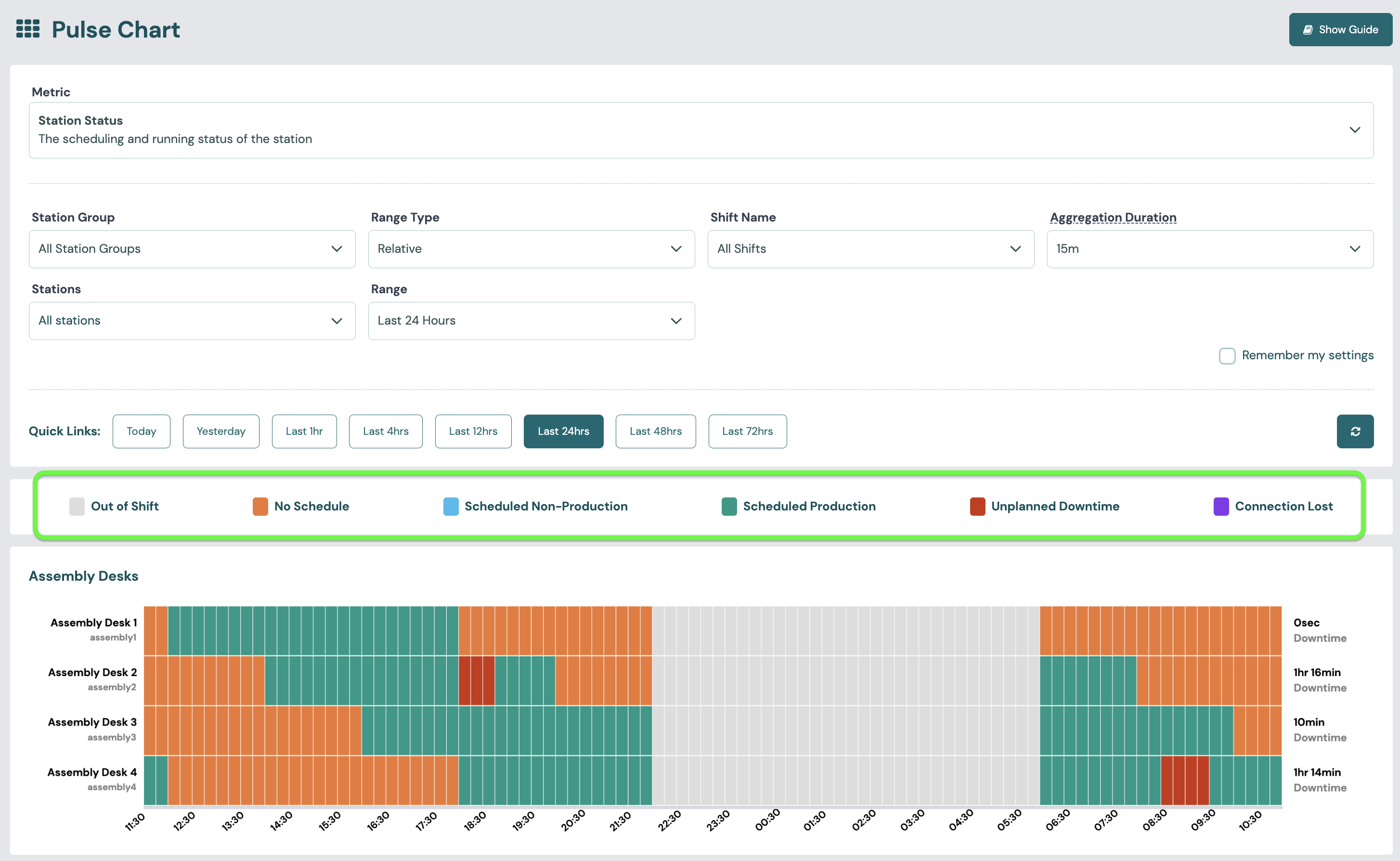
- Pulse Blocks: Plots station status, productivity vs schedule, asset utilisation and energy metrics as a coloured block per time window (for example, each 5-minute block) to reveal detailed movement and enable root cause analysis.
- Interactive Exploration: Users can filter on specific intervals, station, or shift.
- Schedule Context: Production and Non-Production schedules created in Scheduling give context to each period. Schedules are created and managed on the Scheduling pages, not from the Pulse Chart.
- Prerequisites: Complete data input from machinery and configured reporting horizons are necessary for the Pulse Chart to fully function.
Data Setup:
- Ensure high-frequency data capture is enabled for selected metrics (e.g., cycle time, output, energy use).
- Inputs must be mapped correctly to allow cycle-by-cycle, minute-by-minute, or interval analysis.
Formula:
- Most calculations are trend-based, such as identifying peaks/troughs or change against a baseline.
PULSE CHART - SELECTING A METRIC
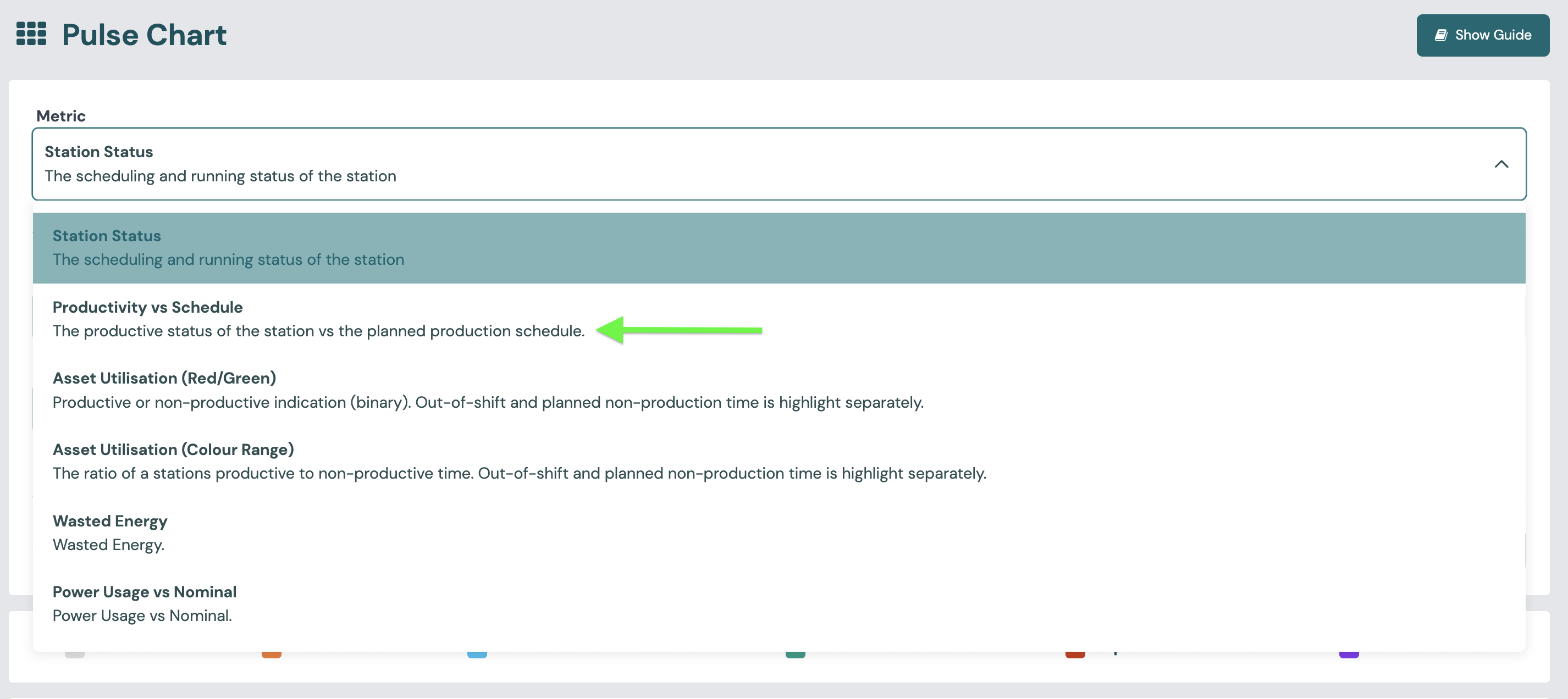
VIEWING THE DATA BY METRIC
Pay close attention to the key that sits above the visualisations for any metric you select. This will explain the colours and values you are seeing for that specific metric.